

Efectul culorilor asupra noastra
Cat traiesti inveti. Stiati ca oamenii pot distinge pana la 10 milioane de culori diferite? Care este efectul culorilor asupra noastra si cum pot fi ele integrate prin tehnologie in casa noastra, aflati imediat.
EN: You learn your entire life. Did you know that people can tell apart up to 10 million different colors? What is the effect of colors on us and how they can be integrated into the technology from our own homes, you will soon find out.
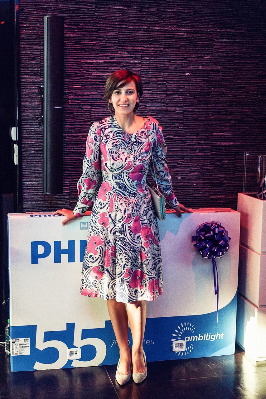
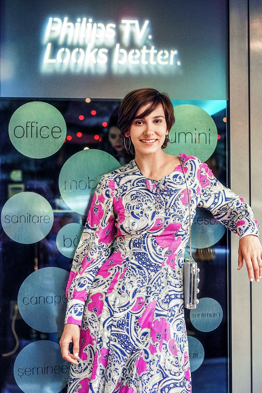
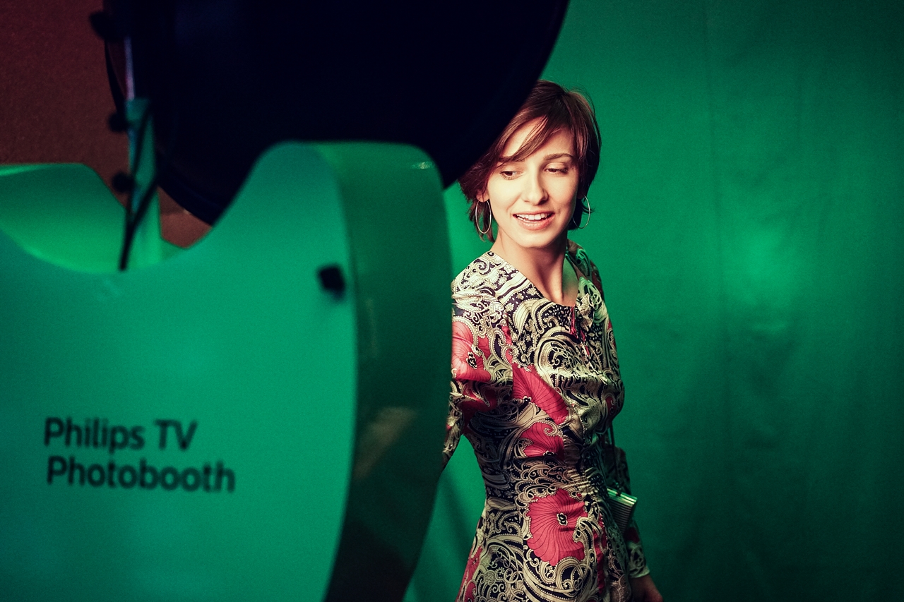
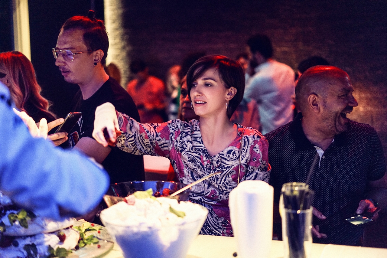
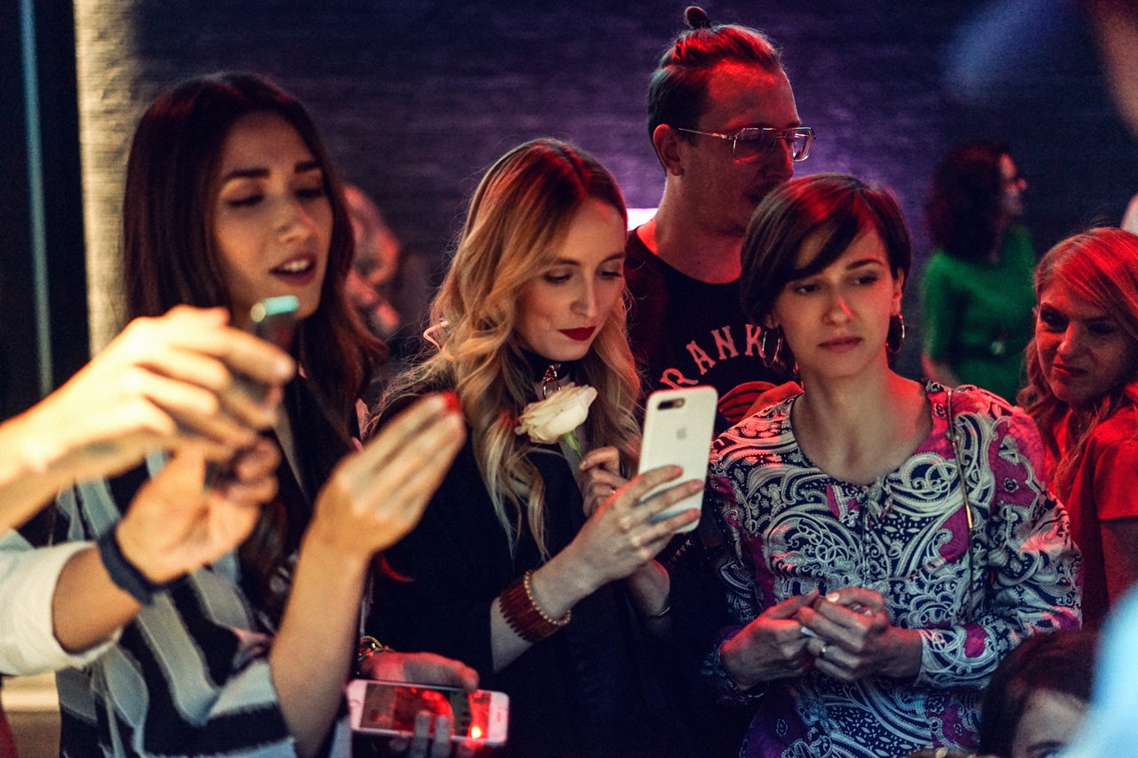
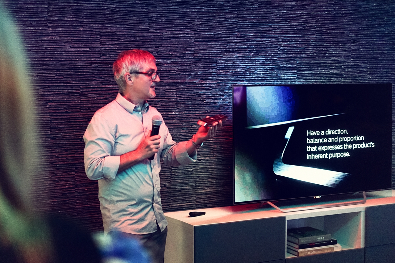

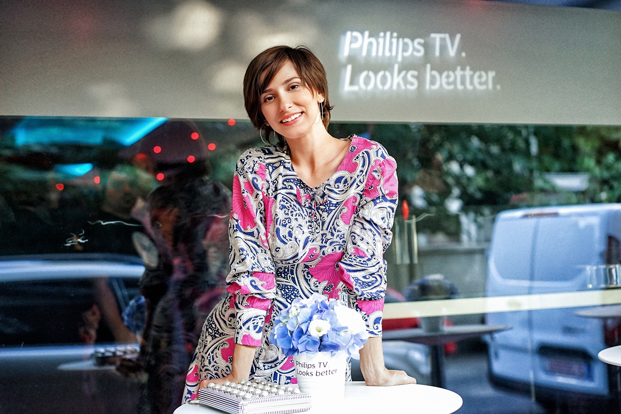
Zilele trecute am fost invitata la evenimentul de lansare a noii game Philips TV si am ramas masca unde poate ajunge tehnologia in zilele noastre. Nu sunt experta in zona de gadget-uri si tehnologie – il las pe Radu sa decida aici -, in schimb pun extrem de mare pret pe design si inovatie. Si cum am ajuns la varsta la care un scaun nou, un covor sau un televizor cu un design superb ma atrag mai mult decat hainele sau accesoriile, noua colectie Philips TV 2017 m-a interesat mult mai mult decat ar fi facut-o cu ani in urma. Si ca sa demonstrez ca e adevarat, va spun ca in timpul evenimentului s-a desfasurat o tombola prin care puteai castiga unul dintre cele 3 televizoare din noua gama a colectiei 2017 –, un televizor incredibil de subtire, fiabil, cu o rama ingusta, claritate incredibila, dotat cu tehnologiile de succes Ambilight si Ultra HD – am completat numaidecat cartonasul, am facut poza si am postat pe Facebook, adica am respectat tot regulamentul concursului doar-doar sa am norocul sa fie al meu. Asta in conditiile in care nu am mai participat la o tombola de cand eram copil! L-am pus si pe Radu sa participe, ca sa avem mai multe sanse, dar tot degeaba. Fabuloasa Diana Enciu a castigat si, ce sa zic, am murit de ciuda.
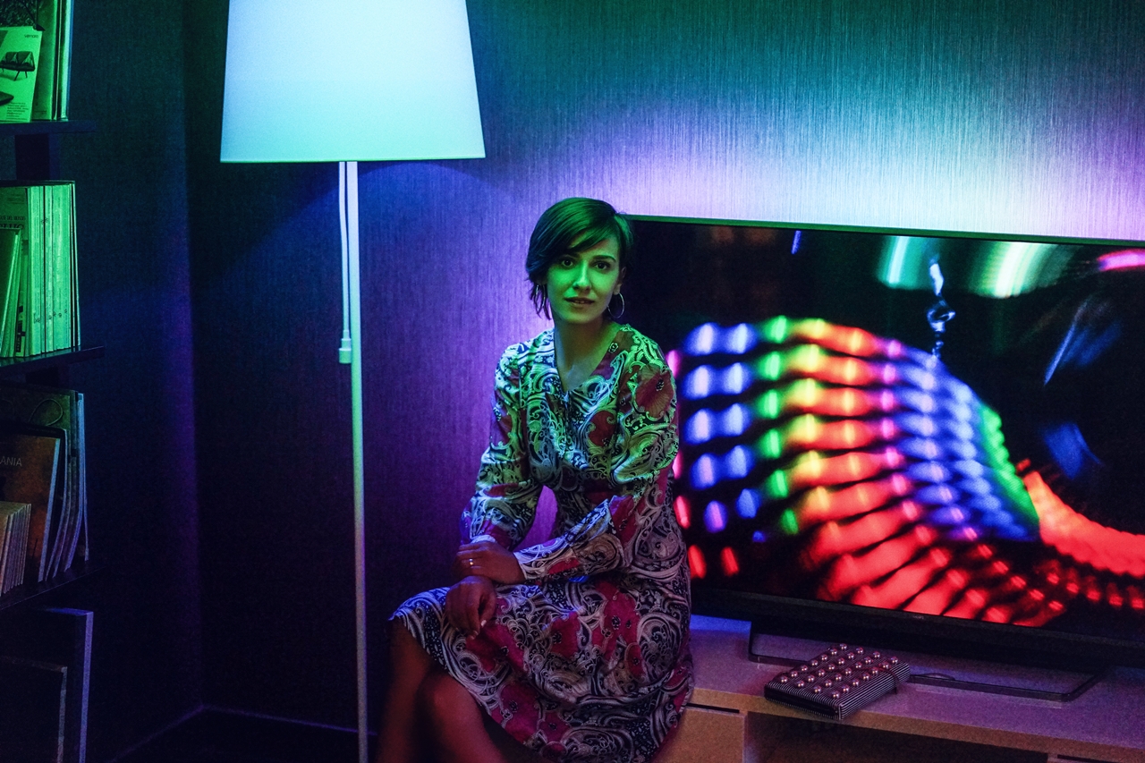
Dar lasand gluma la o parte, ce imi place cel mai mult la aceasta gama este functia Ambilight, care la modelele din 2017 este imbunatatita, adica poate proiecta in spatele televizorului mai multe culori ca niciodata, oferind o atmosfera unica incaperii. Pentru ca, din punctul meu de vedere, cel mai important detaliu pentru ca o incapare sa fie placuta este LUMINA. Fie ca vorbim de o incapere goala, fie de una decorata dupa ultimele tendite in materie de deco, felul in care e luminat spatiul face diferenta.
Rod White, Chief Designer Philips: “Oamenii pot distinge pana la 10 milioane de culori diferite. Stim ca fiecare culoare are un anumit efect asupra creierului care ne influenteaza, intr-un fel sau altul, starea sufleteasca. Roşul, de exemplu, creşte nivelul de energie şi stârneşte emoţiile, movul trimite oamenii într-o stare de somnolenţă, în timp ce galbenul este reconfortant pentru emoţii. Haideti sa ne imaginam care este impactul total al acestor culori afisate pe ecranul televizorului. Cu tehnologia Ambilight, utilizatorul are parte de o experienta imbunatatita si captivanta.”
Ca urmare a numeroaselor studii stiintifice, care au dovedit efectele culorilor asupra dispozitiei unei persoane, Philips TV a introdus o diagrama de culori care cuprinde efectele psihologice ale acestora. Eu am sa redau doar cateva dintre culorile diagramei si efectul lor asupra noastra, caci mi se pare extrem de interesant:
ROSUL creste nivelul energiei. Starneste emotiile si te motiveaza sa actionezi, fiind cea mai intensa culoare. Ea stimuleaza adrenalina mai mult ca oricare alta.
ALBASTRUL este opusul rosului, pentru ca are capacitatea de a scadea tensiunea arteriala. In timp ce rosul iti ridica starea de spirit, albastrul o coboara – dar nu pana la depresie. Daca te gandesti la natura, la cer si la ocean, vei observa ca albastrul iti da o stare de liniste. Fiind culoarea mintii, are un efect de calmare si un impact pozitiv asupra claritatii mentale.
VERDELE este cea mai odihnitoare culoare pentru ochi. Poate reduce oboseala, fiind culoarea repausului si a relaxarii; echilibreaza si calmeaza la nivel mental. Verdele este o culoare strans
legata de mediu, de aceea ofera o stare de relaxare si reconfortare. El linisteste
pentru ca este asociat cu evolutia si natura si simbolizeaza o nastere sau un nou progres – un nou inceput.GALBENUL este cea mai puternica culoare din punct de vedere psihologic. Creste increderea si optimismul si provoaca o stare de bine. Totusi, are si cateva conotatii negative privind starile
bolnavicioase. Este o culoare greu de privit si activeaza zona din creier responsabila de anxietate.PORTOCALIUL imbina conotatiile emotionale ale galbenului si rosului. Este culoarea distractiei, plina de viata si energie si trezeste latura activa. Se spune ca stimuleaza entuziasmul si creativitatea si simbolizeaza vitalitatea si longevitatea. Portocaliul este o culoare versatila, asociata cu monarhia si luxul.
Voi cum va folositi de cromatica in interiorul casei voastre? Ati luat in calcul efectulor culorilor asupra noastra cand ati ales, de exemplu, cum sa vopsiti peretii in dormitor sau camera copilului?
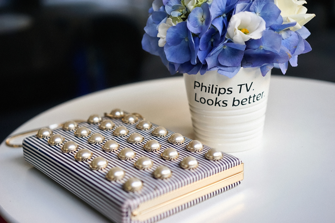
In poze port: rochie vintage de matase, cercei Parfois, clutch Kate Spade, pantofi Zara.
EN: A few days ago I was invited to the launch event of the new Philips TV product range and I was stunned by what technology can do these days. I am no expert when it comes to gadgets and technology- I leave that to Radu- but I am very fond of design and innovation. And since I am that age when a new chair, a rug or a TV with a beautiful design are more appealing to me than clothes and accessories, I was more interested in the new Philips TV 2017 collection than I would have been years ago. And to prove that it’s true, I can tell you that during the event there was a raffle where you could win one of the 3 TVs from the new range of the 2017 collection-, an unbelievably thin, reliable TV with a thin frame, unbelievable clarity, equipped with the successful technologies Ambilight and Ultra HD – so I immediately filled out the card, took a picture and posted it on Facebook, so I followed the entire contest rule book just so I could win it. And the last time I participated in a raffle was when I was still a child! I even made Radu fill out the card, to have more chances, but it was all in vain. The Fabulous Diana Enciu won and, to be honest, I almost died of envy.
But joke aside, what I like most about this range is the Ambilight function, which is improved in the 2017 models, which means it can project in the back of the TV more colors than ever, giving an unique atmosphere to the room. Because, from my point of view, the most important detail for a room to be pleasant is LIGHT. Whether it’s an empty room, or one decorated according to the latest trends in deco and design, the way in which it is lighted makes the difference.
Rod White, Chief Designer Philips: “People can tell apart up to 10 million different colors. We know that each color has a certain effect on our brain which influences, one way or the other, our emotional state. Red, for instance, raises the energy level and brings out the emotions, purple puts people into a sleepy state, while yellow is refreshing. Let’s imagine what the total impact of these colors displayed on the TV screen is. With the Ambilight technology, the user benefits from an improved and captivating experience.”
As a result of numerous scientific studies, which have proved the effects of colors on a person’s mood, Philips TV has introduced a color diagram which contains their psychological effects. I will write down just some of the colors in the diagram and their effect on us, because I think it is extremely interesting:
RED raises the energy level. It brings out the emotions and motivates you to take action, being the most intense color. It stimulates the adrenalin more than any other.
BLUE is the opposite of red, because it has the capacity to decrease blood pressure. While red lifts your spirit, blue takes it down- but not to depression. If you think of nature, of the sky and the ocean, you’ll notice that blue gives you a state of peace of mind. It is the color of the mind, it has a soothing effect and a positive impact on mental clarity.
GREEN is the most relaxing color for the eyes. It can reduce fatigue, being the color of repose and relaxation; it evens out and calms on a mental level. Green is a color closely related to the environment, that’s why it gives a state of relaxation and comfort. It soothes because it is associated with the evolution and nature and it symbolizes a birth or a new progress- a new beginning.
YELLOW is the strongest color from a psychological point of view. It raises confidence and optimism and gives a feeling of well- being. Still, it has some negative connotations regarding sickly states. It is a color which is hard to look at and it activates the brain area which is responsible for anxiety.
ORANGE combines the emotional connotations of yellow and red. It is the color of fun, full of life and energy and it brings out the active side. It is said to stimulate the enthusiasm and creativity and it symbolizes vitality and longevity. Orange is a versatile color, associated with monarchy and luxury.
How did you use chromatics in your homes’ interior design? Did you take the effect of the colors into consideration when, for instance, you chose how to paint the bedroom or nursery walls?
In the pictures I am wearing: vintage silk dress, Parfois earrings, Kate Spade clutch, Zara shoes.
Amy/ 28.06.2017
Da, asa ca am vopsit toti peretii in alb, dar am montat lumini ambientale, o banda cu led uri ce completeaza perfect designul dormitorului. 🙂
http://www.happyamy.ro
Dana/ 29.06.2017
Si benzile au culori diferite?
Amy/ 29.06.2017
Banda are un buton de unde-i poti schimba culorile, insa toate led-urile se aprins in aceeasi nuanta, nu culori diferite ca la instalatia de pom. Poti seta tu ce culoare vrei: mov, bleu, rosu, alb, etc. E super si creeaza o lumina ambientala faina in casa, eu am pus=o intre calorifer si perete, e lipta de calorifer si lumineaza, iar cu perdeaua alba se vede minunat, ma relaxeaza.
Sorina/ 28.06.2017
Nefiind casa mea cea in care stau i-am lasat asa. Sunt albi, si ador albul ca il pot “accesoriza” cu orice?!
Foarte finuta tinua ta ?!
Bizzz
Otilia/ 29.06.2017
da, in dormitor am peretii verzi, iar in bucatarie am faianta si mobila rosii. Sufrageria e neutra – bej, iar camera copilului e inca alba… vom vedea ce optiune va alege cand va putea vorbi 🙂
Dana/ 29.06.2017
S-ar putea ca prima culoare aleasa de el sa fie rosu. Si sa vezi tu atunci cine iti mai adoarme tie inainte de 12 noaptea 🙂
Ina Tatar/ 29.06.2017
Ma mut in curand si am ales ca peretii sa fie albi, dar tavanul din dormitor l-am ales galben. Imi da o stare de bine, imi plac culorile pastelate, inca ma gandesc la sufragerie cum sa o fac, as merge pe un tapet dar nu sunt sigura.
Ewa Macherowska/ 29.06.2017
Love your dress!
Helen/ 29.06.2017
Hi Dana,
I’m the Community Manager with Anagram Interactive, where we specialize in connecting established brands with prominent bloggers. We have partnered with Paperless Post for a recent campaign and think you would be a great fit for the service.
We have seen your blog and admire your sense of style and your fashion know-how. You have thoughtful and engaging posts that make us want to come back for more. We were impressed with your knowledge of brands and your natural ability to create one-of-a-kind looks and would like to work with you for our Paperless Post campaign.
We would like to offer you 1000 digital Coins (a $100 value!) for free to try out Paperless Post’s innovative online service and write about your experience. Paperless Post’s Coins can be used for any digital invitations or digital cards on paperlesspost.com.
Paperless Post helps design custom online and paper stationery to reflect your personal style. The company has collaborated with decorated designers and lifestyle brands like Kate Spade New York, Oscar de la Renta, Jonathan Adler and many more.
Paperless Post has successfully delivered over 85 million cards to date and we want to give you the opportunity to test it out. If you’re interested in this opportunity please let me know and we can show you how to get started.
We look forward to hearing from you!
Please write me at [email protected]
Best,
Helen
Bella WW/ 30.06.2017
In dormitor am ales o combinatie de gri cu galben pentru ca imi place enorm contrastul dintre aceste doua culori, iar galbenul imi da o stare de veselie si optimism. Chiar daca se spune ca rosul creste energia, este o culoare pe care nu as pune-o niciodata pe pereti, mi se pare mult prea greu de suportat. Recunosc, nu prea imi place rosu in general, nici macar atunci cand vine vorba de haine.
https://www.whisperwanderlust.com/ro/